

Madskoler.dk
In collaboration with the NGO Madskoler.dk, we were tasked with improving their website’s accessibility and enhancing user navigation to help save time and resources. Our solution involved redesigning the site to encourage users to find the information they need independently. Through methods such as affinity mapping, empathy maps, and user testing, we identified key pain points and redesigned the user flow and interface, resulting in a more intuitive and accessible experience for users. The final design was pitched to Madskoler.dk, who implemented our solution.
🗓️ September 2021 – January 2022 📍Copenhagen
Our project focused on addressing this issue by redesigning the Madskoler.dk website to improve accessibility and user navigation. The goal was to help users find the information they need independently, reducing the number of inquiries received via email, phone, and social media.
To address this issue, we undertook a redesign of the Madskoler.dk website, focusing on improving accessibility and user navigation. Our process began with exploring the problem through the brief provided by Madskoler, analyzing data sets, and conducting initial user tests. Based on our findings, we defined three design criteria:
- Information must be easily accessible for both volunteers and parents.
- The registration process for instructors should be streamlined and more intuitive.
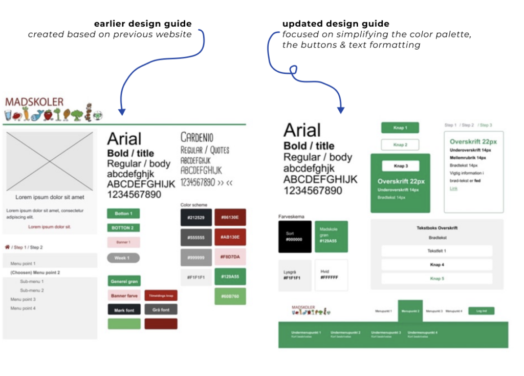
- The visual identity of Madskoler.dk should be modern and inviting, ensuring a clear and consistent style.
These criteria guided our design choices, including the development of a cohesive visual profile that emphasizes color palette, layout, and hierarchy.
Our interactive prototype, created using Figma, allowed us to iterate on design decisions and test the user experience effectively. Key changes included enhancing the instructor registration process, improving navigation to find local cooking schools, and optimizing the menu system for better user access.


In our evaluation, we assessed each design criterion individually and concluded that we had successfully addressed the initial challenge. Additionally, we identified further improvement opportunities and a unique angle focused on social sustainability for the organization.
Finally, we presented a roadmap for potential implementation, divided into three themes:
- Updated visual profile
- Improved user experience
- Focus on social sustainability
Each theme included short-term, medium-term, and long-term changes, offering Madskoler actionable insights to maximize the benefits of our redesign. This structured approach ensures that our project contributes to Madskoler’s goals of efficiency and enhanced user experience.

User Experience:
Our redesign accommodates three primary user personas, illustrated through scenarios:
- Scenario 1: An older volunteer easily finds event information and contacts the relevant consultant for confirmation.
- Scenario 2: A younger volunteer navigates quickly to practical information about volunteering with Madskoler and successfully registers.
- Scenario 3: A parent enters their postcode to find a convenient Madskole for their child, leading to a successful registration.
In this project, I was responsible for both analyzing user data and contributing to UI design tasks. I conducted content analysis, affinity diagramming, and empathy mapping to extract insights from interviews and tests. Additionally, I created wireframes, contributed to the overall user flow, and helped design the interface. I facilitated user testing sessions, utilizing A/B tests for qualitative assessments and Maze for quantitative evaluations, ensuring that the redesigned solution effectively addressed user needs and met our design goals.